Website & Brand
IQ UP!
A bright, playful bilingual site for a children's cognitive-assessment tool, built to take parents from curious to starting the assessment in a couple of taps.
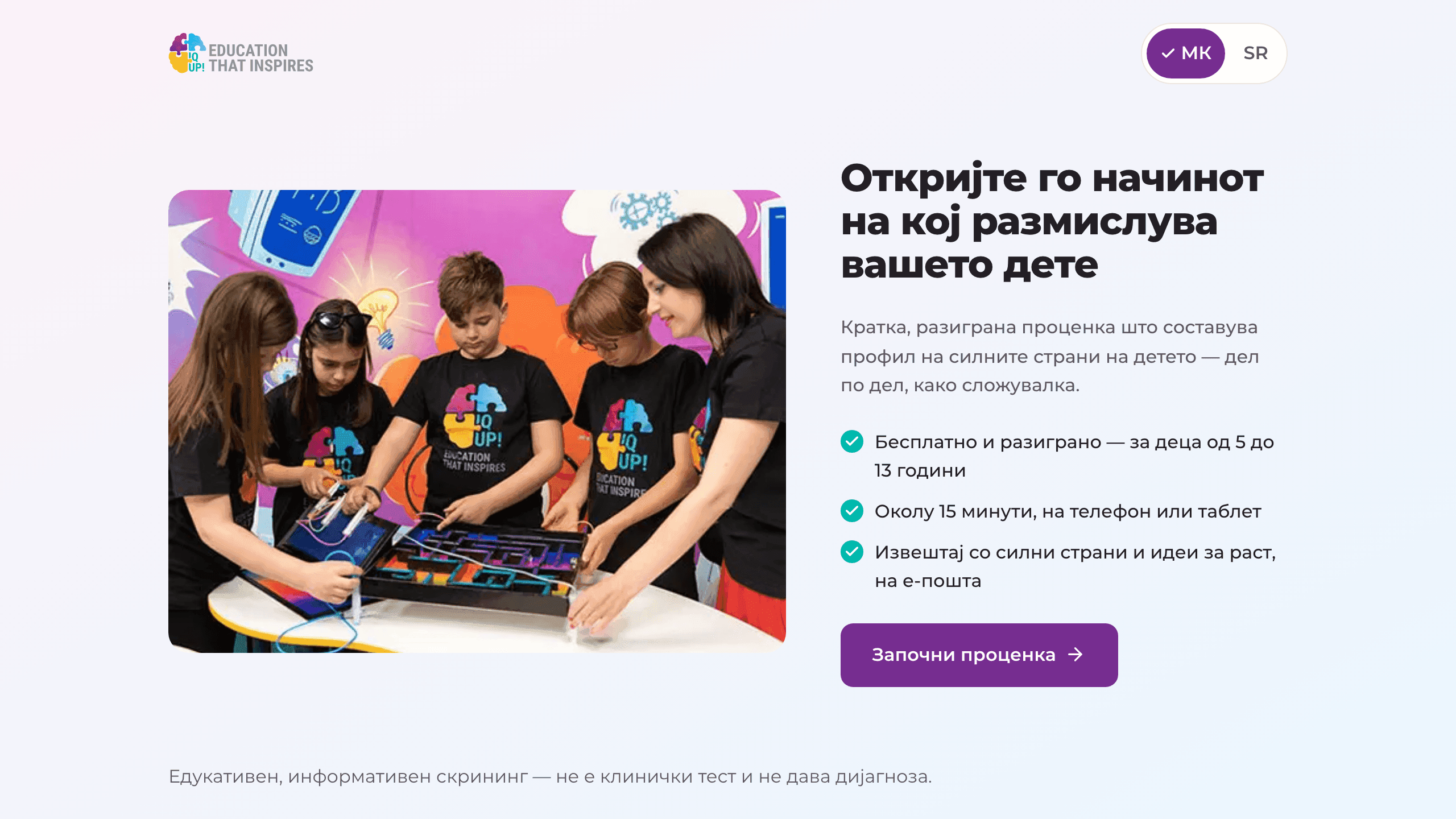
The brief
IQ UP! is an education brand, and this project was a marketing campaign for it, just not the usual kind. Instead of a campaign that talks about the brand, the idea was to give parents something worth their while: a short, game-like cognitive assessment for children aged five to thirteen, free, that builds a profile of a child's strengths piece by piece, like a puzzle.
The people who decide whether that assessment happens are parents, usually on a phone, often with the child in the room. So the site had one job: take a parent from "what is this?" to starting the assessment in a couple of taps. That meant answering the questions every parent asks before they ask them: how long does it take (about fifteen minutes, on a phone or tablet), what does it cost (nothing), what do we get (a report by email, with the child's strengths and suggestions for growth). It also meant being honest about what it is: an educational, informational screening, not a clinical diagnostic. Trust is the whole game when the subject is someone's child.
And all of it had to work in two languages, Macedonian and Serbian.
The build
We built a bright, playful site that looks the way the product feels, closer to a children's book than to a testing platform. Warm photography, generous type, and short, plain answers where a parent expects small print.
Everything on the page points at a single action: start the assessment. The practical facts (fifteen minutes, free, report by email) sit right next to the button, so a parent never has to go looking for the catch. The educational-screening framing is stated up front rather than buried, because a product for children earns attention by being straightforward about its limits.
The site is fully bilingual, with equal content in Macedonian and Serbian, and built for the phone first. The assessment itself runs on a phone or tablet, and the site meets parents where the product does.
What it changed
IQ UP! got a campaign that gives before it asks. A parent who hears the brand's name lands on a page that explains the assessment in under a minute and starts it in a couple of taps (in their own language) and walks away with something real: a profile of their child's strengths. The product's honesty about what it is and isn't became the campaign's best argument, not a disclaimer.